Wednesday, December 16, 2009

The Aldrich Contemporary Art Museum


My last museum experience was The Aldrich Contemporary Art Museum. Again, I wasn’t expecting much. After all, it was in Ridgefield! The museum was set back from the street, and we actually passed the museum twice before we realized where it was. Immediately, I noticed the architecture, and could appreciate the clean lines of the building. The front lawn highlighted sculptures that were made of what looked like rusted iron. There were no plaques to note the artist or medium used; however, the pieces certainly made the viewer take notice. The first lawn sculpture was of a car standing on its back wheels. The second was of an iron spider, and the third was a bike rack that displayed “I’m watching you.” Little did I know the main exhibit was entitled “Bike Rides?” To my surprise, there was no photography allowed in the museum. The staff assured me that I could find all their pieces online if I needed to them.

The museum is a two story building that is one of the only museums in Connecticut that does not have a permanent exhibit. All the pieces in the museum are on loan from private donors. That fact actually increased my intrigue. The main hall displayed a wall size mural that had black and white images and words describing the current state of our globe due to climate change. There were all sorts of facts about riding bikes, and the benefits that it would have on the climate and global warming.

The first room housed bikes that were actually ridden by bike groups. There was a trio of “low riders”, which were no more than 1 yard in height, from a group out of New York. The bikes were elaborate, and had tons of decorative metal designs and axils. There was another bike displayed that had hundreds of signs, flags, stickers, horns, and even an actual radio with speakers. It was a billboard for Puerto Rico, as everything on that bike had something to do with Puerto Rico. The front sign said, “Yo soy Boricua. Mi amor es Puerto Rico”, which means, I am Puerto Rican. My love is Puerto Rico. I don’t think anyone could argue who much the owner loved Puerto Rico after seeing the decoration on that bike!

There were other bikes displayed throughout the museum, as pieces of art, and as bikes that people can actually ride. Lance Armstrong’s bikes were displayed, and the docent directed us to a bike that was for sale for $8000! Amazing, I didn’t know that bikes were even sold for half that much! Upstairs, there was a less expense bike, and was owned by a Chinese man. He had hung inflatable balloons from the bike, and would bike around villages in China and give them to children. In addition, there were also sculptural pieces by Edward Tufte that were exhibited in the gallery, as well as, on the back lawn.

The one artist that captured my attention immediately with her taxidermy work was Kate Clark. Kate is a Michigan native who combines taxidermy with sculpting. Her work is as realistic as Hanson’s work, which had me in awe at the Yale Art Gallery. Kate uses real animal heads and bodies and sculpts human faces on them. The eyes are rubber and the faces are made out of leather, clay, and foam, and are emphasized with small metal pins. Kate’s goal is to show how similar animal faces and facial expressions are to humans. The docent quoted an interesting fact about children with autism when discussing Clark’s pieces. She noted that most children with autism do not look at other people in the eyes; however, they do with animals, possibly because of an innate connectedness that humans unknowingly have with animals.
The initial piece that grabbed my attention was of three antelope whose gazes were fixed on the entry way. The bright blue eyes of the center antelope shocked and scared me, all while intriguing me. As I looked closer, I could see that there were pieces of the animal’s skin that were positioned like patchwork and combined with the other mediums. Fascinating! Clark’s other pieces from that series was a head of a zebra and a baby bison. The baby bison’s face was so cute, and reminded me of my daughter’s face when she’d look up at me as to say, “Hey, don’t forget about me.”
I certainly will not forget about this exhibit or this museum. I am excited to see what new pieces will be added in January when the exhibits change. I look forward to visiting Ridgefield and the Aldrich Museum again.

Monday, December 14, 2009

New Britain Museum of American Art


On Saturday, I visited the New Britain Museum of American Art. I must admit, I was not looking forward to going to this museum. American art is not my favorite, so my expectations for enjoying my trip were very low. To my surprise, I not only loved this museum, but I made sure to tell one of the staff that “this museum is the best one that I’ve been to.” Don’t get me wrong, the Metropolitan Museum of Art was fabulous, but who knew that New Britain held such a fabulous little jewel in its hand.
The museum which boasts the tagline, “Where art meets life”, was a small two story museum. The architecture is a piece of art itself consisting of an angular design. The sculptures which inhabit the front lawn and walkway prepare the visitor for an exciting and creative experience through art once inside. As soon as you walk into the museum, you’re greeted by a grayscale vertical mural. The design stands out against the bright yellow walls in the background. I hit the bathroom before I started on my quest, which I was already excited about. Even the bathroom had artwork on its walls! I looked up and saw a speckled, collage-like, whimsical design trailing around the room. I loved it.
The ground floor of the museum showcases more than 5,000 works of art dating back to the 18th century to the present. The periods that are represented include the Colonial period, the Hudson River Can School, genre painting, the American Impressions, the Ash Can School, the early moderns and works by contemporary artists. One of the most captivating pieces was a mural by Thomas Hart Benton. It hung in a room covering three walls. It depicted life in America through the eyes of Americans. The colors were opaque and intense. It seemed like the artist put a lot of thought into which details should be included in the mural. I can only imagine how much work was put into the piece.
As I made my way through the ground floor and up to the second floor, I stopped to enjoy the many pieces that decorated the foyer. There was mesmerizing pieces that hung on the walls. Many of them were portraits. Some done from charcoal, others from pastels, or paints. A beautiful charcoal drawing of a woman caught my attention. It was lovely. As I made my way to the stairs, I noticed a portrait of, what looked like a black man, with an afro. Toward the top of his head and hair there were three sets of eyes. What looked like broken glass was drawn as an outline to the painting. Understandably so, it was entitled “Paranoia”. If that weren’t enough, I shifted my gaze towards the stairs to take in a two story 3-d piece entitled “The Gravity of Color” by Lisa Hoke. It was enormous. When I moved closer, I saw that it was completely constructed of cups. Most of them were plastic cups that were painted on the inside. There were some paper cups that were included in the piece to give it a greater sense of depth and texture.
The second floor was the most modern part of the gallery. The main exhibit was illustrations from children’s books. The art was fabulous. Most of them were water colors, and the details, depth of color, and sharpness of the paintings were phenomenal. I was floored. I felt like a kid in a candy store. It was if I were in a dream, floating along from cloud to cloud watching individual stories take play out. I saw paintings of animals eating vegetables, houses under twilight skies, Eskimos, and astronauts. There was a huge piece demonstrating the devastation of 9/11. I didn’t realize the subject of the piece until I read the description and looked closer. The final piece on the second floor was a piece illustrating the ABC’s of America.
This museum had so much to look at. There different style pieces everywhere and boredom was NOT an option. We went back downstairs, and to my dismay, we had gone through the entire museum. I was shocked. I had gone from not wanting to come to New Britain to not wanting to leave. Like a jewel, when you look in it, you find new and different colors every way you turn it, the New Britain Museum of Art was filled with pleasant surprises, and absolutely talented artists.
The piece that I chose to focus on was not the most captivating piece in the museum; however, it spoke to me as soon as I saw it. I can only imagine that it did so because of the current speed of my life. The piece, entitled “Sunset on Sea” was created in 1872, by John Frederick Kensett. The medium used is oil on canvas. The frame was gold and ornate which enhanced the impact that the painting had on me. As I walked in the room, I knew I would be writing on this piece. Its stillness grabbed me immediately. I was drawn to the colors which reminded me of my nights in Africa. The colors blended seamlessly. As I moved towards the painting, I realized that the water was not. The water was just as still as the painting hanging on the wall. The brilliant sun pushing its way through the center of the colorful clouds pulled me closer to the center of the painting, deeper into the sea. I almost cried. My life has been moving at an unprecedented speed, and as much as I want it to slow down it does not. As I looked at the “Sunset on Sea” I was forced to stop. Stop. I sat and listened to my breath. I let time stop in my own world as I let everything else buzz around me. With my senses heightened, I could hear the children laughing on the stairs in the hall. I could hear the air move as my fiancĂ© passed through it. I could smell the museum, and see time absolutely stop as I stared at the blessing hanging on the wall. Even as I type now, I hold back tears, because I know that that painting was a miracle; an unexpected blessing of the greatest magnitude because I needed that very thing at that very moment. I needed life to slow down so I could enjoy it. The experience that I had while looking at the painting probably contributed to the fabulous time that I had throughout the rest of the museum.
The artist, Kensett, had several paintings in the gallery. The information that the museum shared noted that Kensett made 38 paintings throughout the summer of 1872. The collection was entitled, “The Last Summer’s Work.” The soothing pieces were thought to have been made to combat the cruelty of the Civil War devastating the country. The collection which was discovered after Kensett’s death was exhibited at an auction sale of his work. Reverend Dr. Samuel Osgood leaves the most fitting quote describing the painting as “…no land or sail, no figure, and not even a noticeable cloud to give peculiar effect, or a rock to provoke the dash of waves. It is pure light and water, a bridal of the sea and sky.”

Saturday, December 12, 2009

The British Museum of Art

The top floor exhibit had pieces from the 17th-18th centuries. Most of the paintings were oil on canvas, and featured the following artists: John Glover, Samuel Scott, J.M.W. Turner, John Singleton Copley, Allan Ramsay, Sir Joshua Reynolds, Joseph Wilton, George Beare, Philip Mercier, Sir Anthony Van Dyck, John Martin, Willem Wissing, Simon Verest, and Joseph Wright of Derby.

(Artist unknown)


The first floor with exhibits housed pieces primarily from the 1600's to the 1700's. The artsists for the following pieces are John Stevens, George Stubbs, John Closterman, John Vanderbank, Philippe Mercier, Joseph Wright of Derby, and Sir Joshua Reynolds.


The British Art Museum is located in downtone New Haven, CT on the Yale University Campus. It has three floors of exhibits. Most of the exhibits are opene xhibits; however, there are currently 2 private exhibits in which pictures were not allowed. The first exhibit was entitled "Mrs. Delany and Her Circle". Mrs. Delany was a letter writer, ametuer artist, woman of fashion, and a naturalist. Many of the pieces that Mrs. Delany created were of flowers and plants. Many of the pieces exhibited were done in a collage style. The works of art were primarily from the 19th century, and the exhibit was organized by the Yale Center for British Art and Sir John Soane's Museum in London.
The second private exhibit was a collection from Horace Walpole entitled "Strawberry Hill." Many of the pieces in the collection were from the 15th- 18th century. The artists with pieces in the collection are Paul Sandby, John Philipps, Johann Heinrich Muntz, John Giles Eccardt, Marcus Geeraerts, John Carter, Edward Edwards, William Faithorne, Jean Antoine Watteau, Richard Bentley, and Hendrick Danckerts.


Thursday, November 26, 2009

Wadsworth Antheneum 11/21/09

Me and my daughter standing in front of the Wadsworth Antheneum.


This last set of photos are of a picture that showed a mythological woman who had chosent o die in the place of her husband. Hercules, being moved by the woman's love for her husband, struggles with the angle of death.


This piece illustrated a man who was enamored by the women in the house. The detail and color in the painting was fabulous!


Wednesday, November 18, 2009

Yale Art Gallery 11/17/09


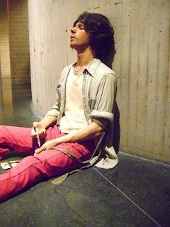
This week I visited the Yale Art Gallery. I have been to this gallery several times, and was shocked to find a piece that was so captivating that I was exhausted after I reflected on it. The piece that I chose to focus on was entitled “Drug Addict” created in 1974 by Duane Hanson. This piece was captivating, and I will focus more closely on it later in the paper.

Duane Hanson was born in 1925 and died in 1996 at the age of 71. He was an American artist, born in Minnesota, but spent the duration of his life in southern Florida. Hanson‘s art career began to gain attention when he started creating figures grouped in tableaux. Many of his pieces featured controversial themes like, police brutality and abortion, and highlighted issues that arose from the riots of 1960. Beginning in the 1960s, Hanson’s sculptures began to be more lifelike. His works, which were cast from actual people, were made of fiberglass and then reinforced with fiber resin. They were then painted to create complexions, blemishes, and other body marks. Hanson’s works were so shockingly lifelike that they received a strong response from critics. His work is grouped in the pop art and hyperrealism genres, and has been compared to 19th century French realists such as Honore Daumier and Jean Francois Millet.

The piece, “Drug Addict” was mesmorizing. The life size creation of a young heroin addict shooting up was shocking real. Only as I moved closer to the figure could I see that the figure before was not flesh. The positioning of the figure added to its realism. The figure was sitting upright leaning against the hard cold cement wall of the gallery and sitting on the black marble floor. The head was cocked upward with a slightly opened mouth. The eyes were closed. In one hand the figure held a syringe. The other hand was empty; however, just above the elbow was a fabric belt that was wrapped around the arm. The figure looked like it had just shot up. To add to the effect, a dirty metal spoon, matches, and a piece of paper laid in between the figures legs on the floor. The man wore real clothes. They were dirty and tattered. The shirt up off the figure in an easy way. The pants and shoes fit. The complexion was pale. The skin was dirty and was not clean shaven. The beginnings of a beard and mustache were taking shape. There were moles on the face and by the mouth. I could see the raised veins in the arms, and noticed track marks on both forearms. The hair looked real and the placing of the eyelashes were so deliberate, not a single one looked out of place.

Since I work with families effected by addiction all day, this piece hit close to home. The expression of false satisfaction was glearingly true. I found myself saddened by what I was witnessing. Many of the children that I advocate for in court see this. They see their parents shooting up, or if their parents are aware enough of their young ones, they hide themselves in the bathroom, and sit on a floor simlar to the one I was standing on. The cement wall and cold black marble added to the reality of this piece. Drugs are cold. The effects of drugs are cold. There is nothing pretty about drugs. There is nothing nice. When looking at the figure, I could appreciate the perfect imperfections. Our skin is not normally airbrushed, like we see in the magazines. It is blotchy and has marks. Furthermore, the positioning of our body is not stiff like a mannequin. The artist did an amazing job by creating the realistic way a person sits. I was floored!

Many of the other pieces in that section in the Yale Art Gallery were great. There were digital creations that were displayed on televisions, videos that were in conjunction with physical pieces, ones built of furniture, and manipulated photography series. The other sections in the gallery highlighted asian and african art, other types of pop art, and european art. The african art section was quite intriguing. The masks, made mostly of wood, were elaborate in their carvings and in the additions of fabric or straw. If I could highlight other pieces in the musuem, I would certainly highlight a mask from that section.

Sunday, November 15, 2009

Metropolitan Museum of Art 11/12/09


The piece that I selected to focus on during my trip to the Metropolitan Museum of Art, was one that caught my attention as I was moving from room to room. The sculpture sat in the recesses of an angular foyer. The soft lines of this piece coupled with the shadows that were cast from the ambient lighting allowed me to see its apparent beauty. There was very little displayed as an explanation for this piece entitled, “Latona and Her Children, Apollo and Diana.” The artist is William Henry Rinehart who was born in 1825 and died in 1874. He sculpted this piece in 1874 out of marble; however, another version was done in 1870. Though, the museum did not display much about the piece, I found that it represents the mother love with her children.

There were other sculptures done with Latona and her children as the subjects. The first ones were done in the 1600’s. The first artist to use Latona and her children as subjects was Gaspard Marsay. He was commissioned to create a fountain for the Palace of Versailles by King Louis XIV. Apparently King Louis was enthralled by the mythological story of Latona and found parraleles between her story and his.

Latona, a mythological figure, was said to be the first wife or possibly the mistress of Jupiter, the king of the gods. Jupiter married Juno, and Juno found herself very jealous of Latona and her children. Once Jupiter was married, Latona and her children had to find a place where they could establish for themselves. On their journey, Latona and her children became very thirsty and when they came across a lake, Juno muddied the waters so they could not drink from it. Jupiter found out about this misdeed against his mistress and knew that he could not punish her since she was his wife. In his quest to show honor to his mistress, he turned Juno’s informants into frogs. It’s said that King Louis had a mistress and erected a sculpture of Latona and her children in his palace courtyard, to warn his countrymen of their punishment if they were ever to harm his own mistress.

This particular sculpture of Latona and her children shows the peace and ease of this life. Latona’s facial expression seems pleasant and she seems to delight in her children sleeping close by. The children seem to have no worries, and I can imagine that they did not want for anything as the children of the king of the gods, Jupiter. The structure of the sculpture is made of marble which allows for the smooth lines of this piece. The Grecian draping that is sculpted as clothes are distinct and portrays a lightness of the fabric. Rinehart captured the facial expressions of all three subjects and made the body figures very realistic. The medium lended itself to creating the smoothness of skin.

The most fascinating thing that pulled me into this piece was the positioning of the two children. The children are wrapped in each other in their mother’s lap. They seem so at ease, and the boy who is reclining seems to holding his sister on his own lap. This positioning made me think of my niece and nephew who are close in age. The older one, the boy, is very vigilant with his sister, and my niece depends on him for the security and surety that he provides. The artist does a great job of communicating that to the viewer.